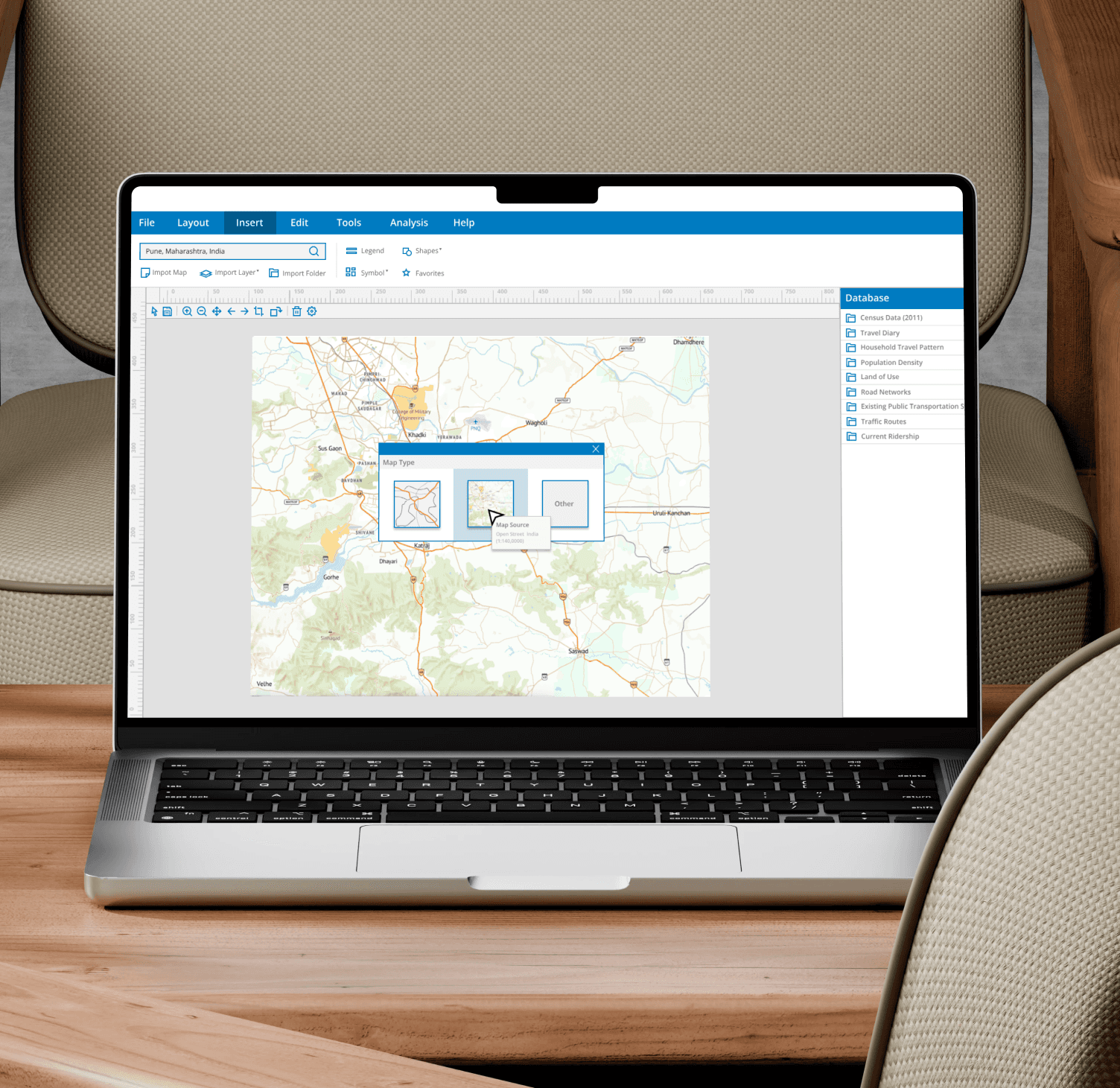
Map My Way — a desktop application concept designed to help users create optimized subway system configurations and layouts.
Project Type
Design Challenge
My Role
UX Designer and Researcher
Toolkit
Figma, Adobe Illustrator, Adobe After Effects, User Research, Prototyping, Usability Testing, Design System
Collaboration
Transportation Engineer, 3 Software Engineers (Research Participant)
As part of a Design Challenge, I developed Map My Way—an intuitive desktop application that enables users to design subway system configurations and layouts optimized for high-traffic routes during peak times. The target user for this application is a transportation engineer responsible for designing and managing subway systems.
Process
Problem Statement
The challenge involved designing a high-level concept for an application tailored to transportation engineers tasked with creating a new subway system for a specific city. The primary goal was to develop a configuration and connection layout that optimizes high-traffic routes during peak times. This application is intended for use by a single user to design an underground system, allowing me the freedom to make my own assumptions throughout the process.
Solution
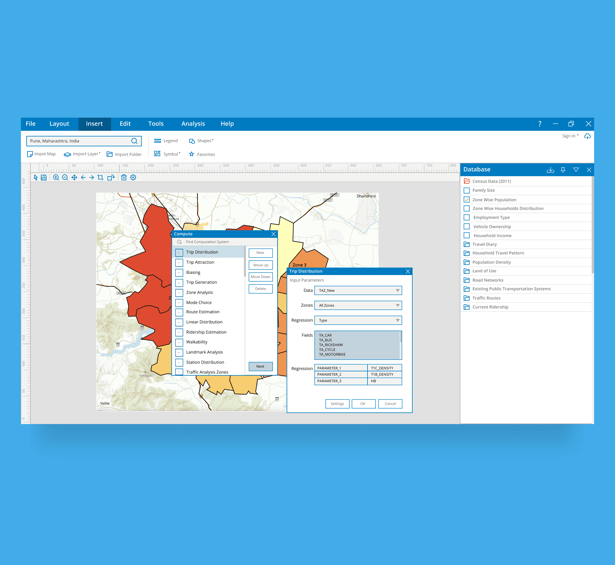
I developed a desktop application concept specifically for transportation engineers, enabling them to design optimized subway system configurations and layouts. The application focuses on streamlining the creation of high-traffic routes during peak hours, providing tools to efficiently plan and manage complex underground networks. This solution allows engineers to make data-driven decisions, balancing efficiency and capacity in urban transportation planning.
Discover
Breaking down the challenge
The project started with a broad application and scope. To create an effective design, I considered various factors, including parameters and user demographics specific to Pune, to inform the development of the subway system. I also outlined key research questions to gain a comprehensive understanding of the challenge.
Research Assumption 1
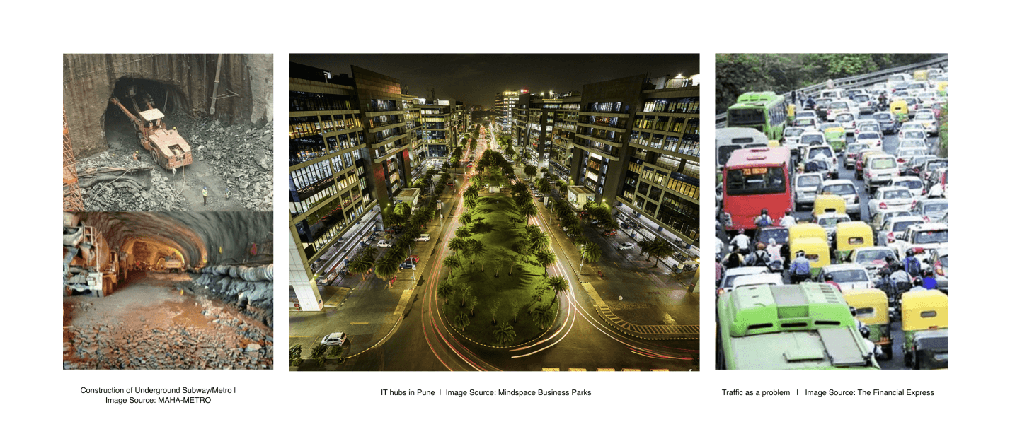
Based on the given assumptions, I decided that the transportation designer would be working on an underground subway system for the city of Pune in Maharashtra, India. Pune is emerging as a major technology and startup hub, with many IT companies establishing offices in the area. This growth has created a pressing need for a robust public transportation system. The ongoing development of the Pune Metro aligns with our assumptions, as it indicates that land acquisition for the project is feasible. Thus, I chose Pune as the reference location for the design process.
Desk Research
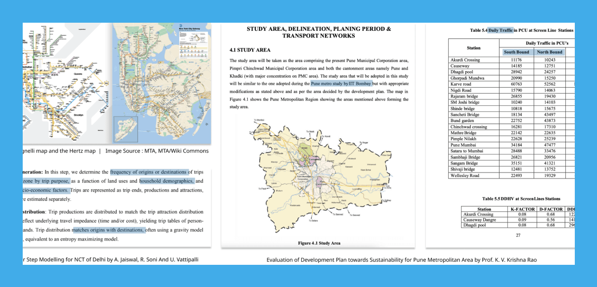
After the initial discovery stage, I conducted desk research. In a typical UX Designer role, I would collaborate with User Researchers to gather insights. However, since I was responsible for the design challenge, I took the initiative to research the city’s layout, existing transportation systems, and tools that could aid in the design process. I drew insights from classic case studies, such as the London Tube Map and the New York Subway System, and further explored previous research, articles, and government reports.
Stakeholder Analysis
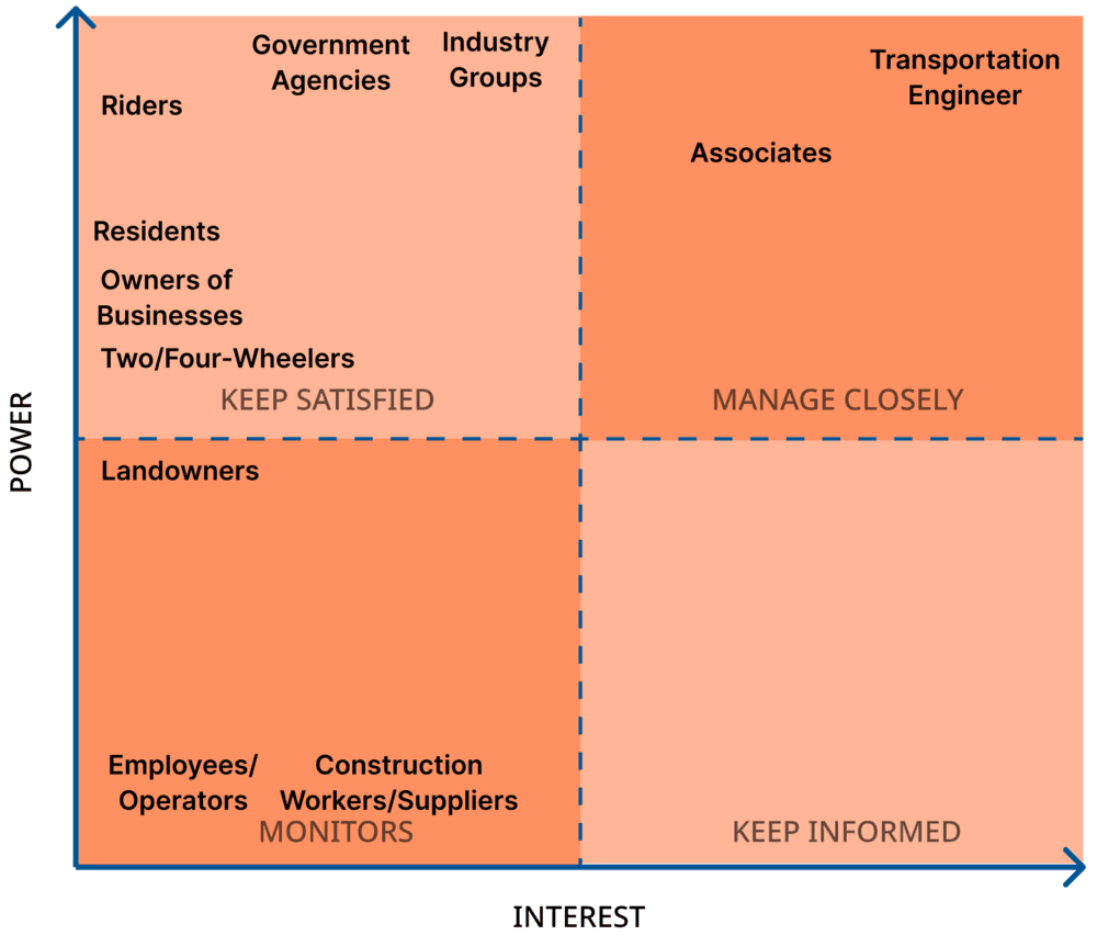
I identified the Transportation Engineer as the primary stakeholder for the application. I then mapped out the indirect stakeholders who comprise the larger ecosystem of the subway transportation system, as they are indirectly affected by the configuration and connections of the subways. To visualize their influence, I used a Power-Interest Matrix (Mendelow’s Matrix), plotting stakeholders on the grid based on their power and interest regarding the project.
Job Shadowing and User Interviews
I reached out to a former colleague, Uthej Vattipalli, through LinkedIn. Uthej is a Transportation Engineer with valuable experience in designing transportation systems both in the US and India. Through our conversation, I gained insights into key data considerations and the processes involved in creating a transportation system.
From the interview, I noted several important factors that a Transportation Engineer must consider before designing any system. One key insight was the use of data from “Travel Diaries” to analyze user travel patterns. This helped me understand how a Transportation Engineer approaches the design of a new subway system aimed at optimizing connections for high-traffic routes during peak hours.
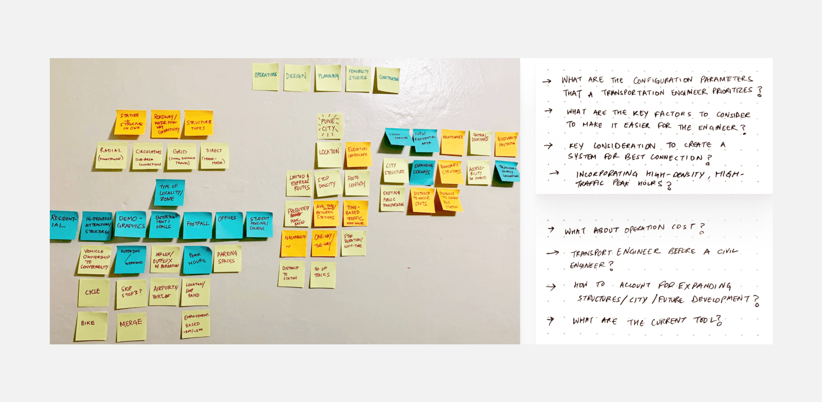
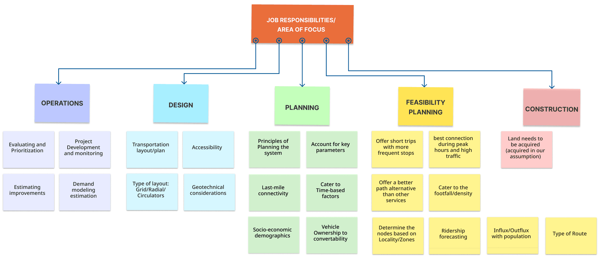
Since the application is intended for a Transportation Engineer, I focused on understanding their job responsibilities, key considerations, and factors they must account for when designing a new subway system. Some of these insights were gathered from my initial brainstorming sessions, which I documented on post-it notes.
Define
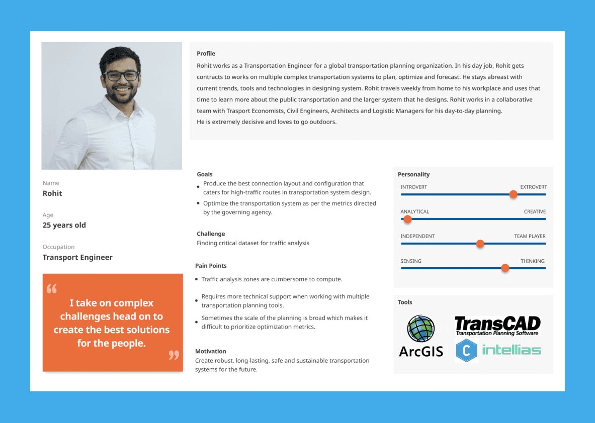
User Persona
With the Transportation Engineer as the focused user group, I combined the interview insights with my research to identify key pain points in designing a subway system that provides optimal connections for high-traffic routes during peak hours.
Final Assumptions
The application is designed for a single user.
The chosen city is Pune, Maharashtra, India, to provide context and inform the model based on local demographics.
The backend includes a computation model (e.g., regression) developed in collaboration with a software engineer and a transportation engineer.
Data sources such as Census data, traffic flow, and the existing transit network are accessible.
The Transportation Engineer is knowledgeable about the required dataset selection for specific models and computations.
User Flow and Brainstorming
I developed a User Flow to visualize the steps a Transportation Engineer would take to complete tasks, assuming backend computation and familiarity with relevant datasets and functions. Additionally, I brainstormed key screens and features for the application. As a visual learner and creator, this step was essential to shaping my design process.
Develop
Creating and Implementing Design System
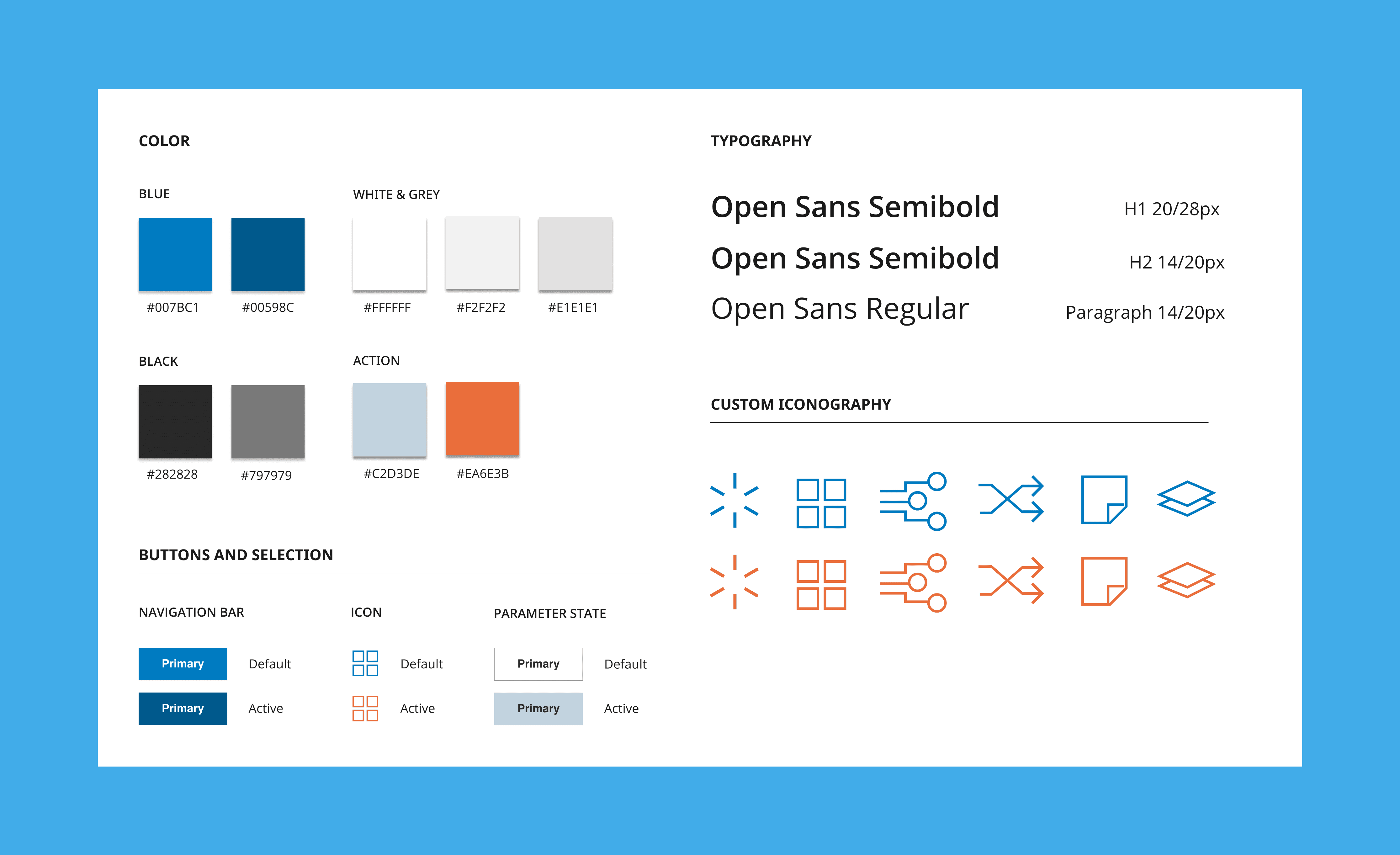
The visual design for Map My Way is minimalist, clean and inspired from the principles of Google’s Material design system. I also considered color psychology, accessibility principles and used a high contrast blue color to carry subtle messages of trustworthiness and transparency along with a little vibrancy of the orange to communicate clear visual cues that something is active.
Wireframing
I created low-fidelity prototypes to establish the foundational structure, and then thoughtfully transformed them into high-fidelity prototypes using the design system for consistency and clarity.
Deliver
I conducted two rounds of iterative user testing with 3 engineers. The first round involved A/B testing of the initial screen design, where both testers preferred the simplicity and clarity of version B. I found that the double design process lacked true iteration, so I integrated my insights to refine the design based on user feedback. In the second round of testing, I focused on evaluating interactions and the overall user experience with the clickable prototype. I received valuable feedback, particularly regarding the need for more customization options after adding each layer. I plan to incorporate this feedback as I develop the “Layout” tool to enhance customization for the Transportation Engineer.
Key Takeaways
The Design Challenge deepened my understanding of applying design principles in a technical product environment. I aimed to demonstrate a user-centered design approach while addressing user pain points. The application features were crafted to ensure an easy-to-navigate experience. Looking ahead, I plan to integrate more accessibility features and explore chat-based support options. A key challenge was accessing quantitative data through user surveys within the timeframe; however, I leveraged qualitative insights from my interview with a transportation engineer. Future iterations of the application will focus on enhancing customization for the engineer by incorporating quantitative data, user testing, and feedback. I also intend to integrate measurable metrics to refine the design and assess the application's performance.
