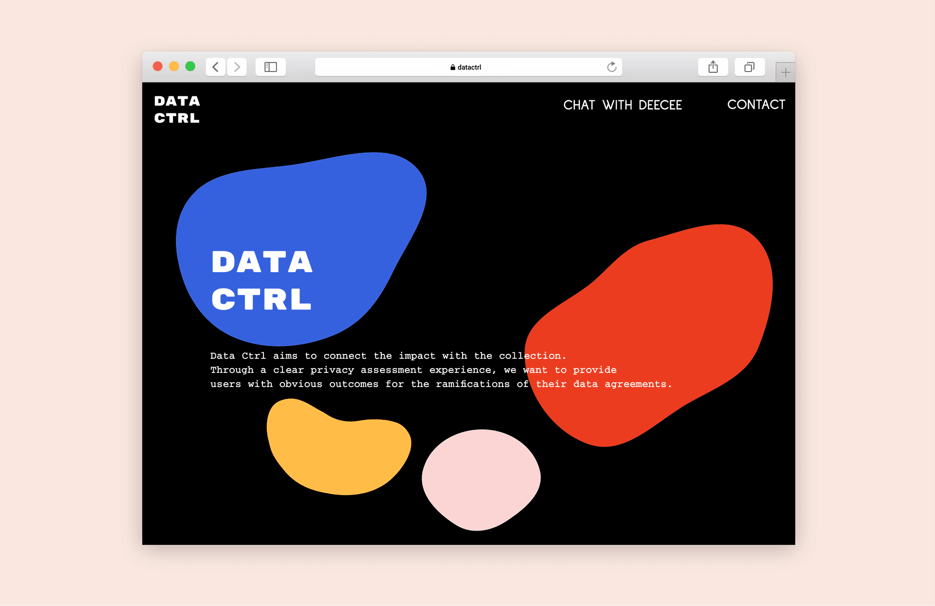
DATA CTRL — a chatbot that connects users with the ramifications of their data choices and helps control data outcomes.
Project Type
NYC Media Labs x Consumer Reports Data Privacy Prototyping Project Grant
My Role
User Experience Designer
Toolkit
Figma, Adobe Illustrator, Adobe After Effects, Notion, Human-Centered Design, Storytelling, and Design System
Team
Bhavya Gupta, Rosa Ng and Sohee Cho (Design and Concept Development)
Jason Li and Mary Ann Badavi (Research and Content)
Process
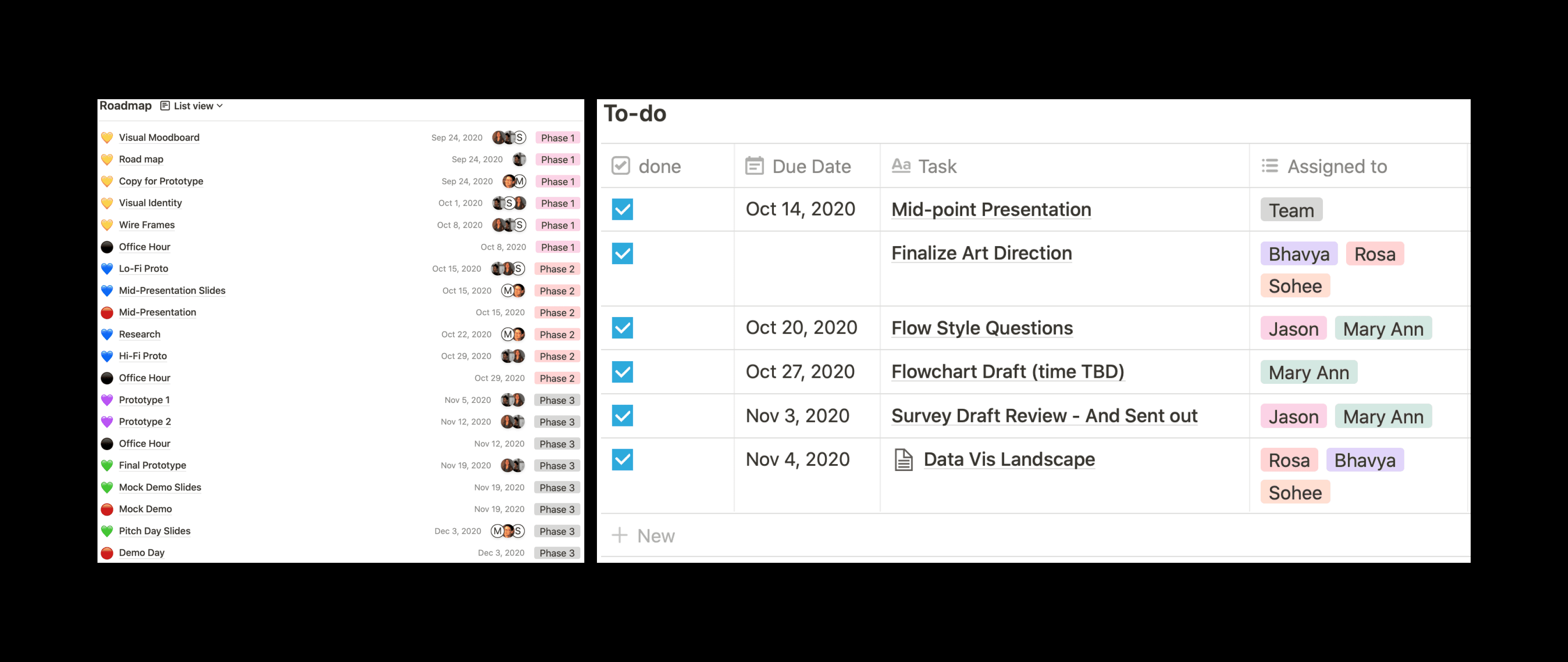
Project Roadmap
Since the project was a remote collaboration amongst the group, to meet the project deadline, we created a project roadmap in order to manage tasks efficiently within the team. We divided the project into 3 phases: Phase 1 comprised of discovery, research, and wire framing. Phase 2 of the project consisted of low-fidelity prototyping, simultaneous research, and consultation with the Consumer Reports Digital Team. Lastly, in Phase 3, our focus was to work on the high-fidelity prototype idea to pitch for the final presentation.
Discover
Background
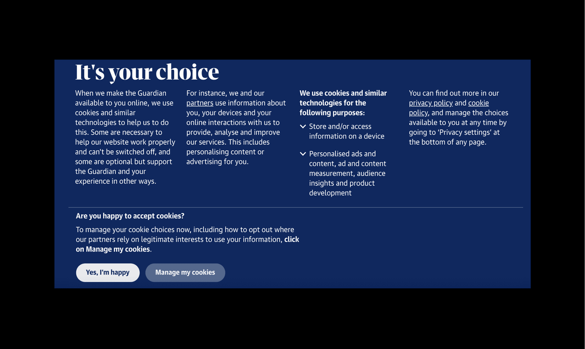
Today, it is hard to manage how companies collect and distribute personal information on the web. Every company has its own version of a policy. Privacy policies are long, detailed, and usually not written in plain language. And every company has its own version of a policy, so you have to opt-out at every individual site. And each site has a different language about the preferences you’re selecting. Even if you take the time to understand and select your desired privacy settings, it is challenging to know the consequences of opting in or out. Simply put, reading a privacy policy and understanding the consequences of your choices is not a user-friendly experience for anyone but the company.
User Surveys
The audience of this project are laypeople who are not familiar with the data/advertising economy but may want to have more control over their own data. (Did you know you could opt-out of data collection by certain advertising companies? (https://optout.aboutads.info/)
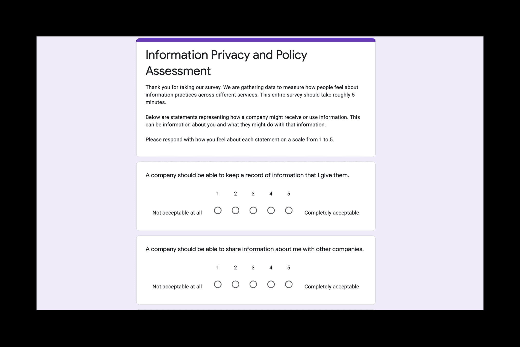
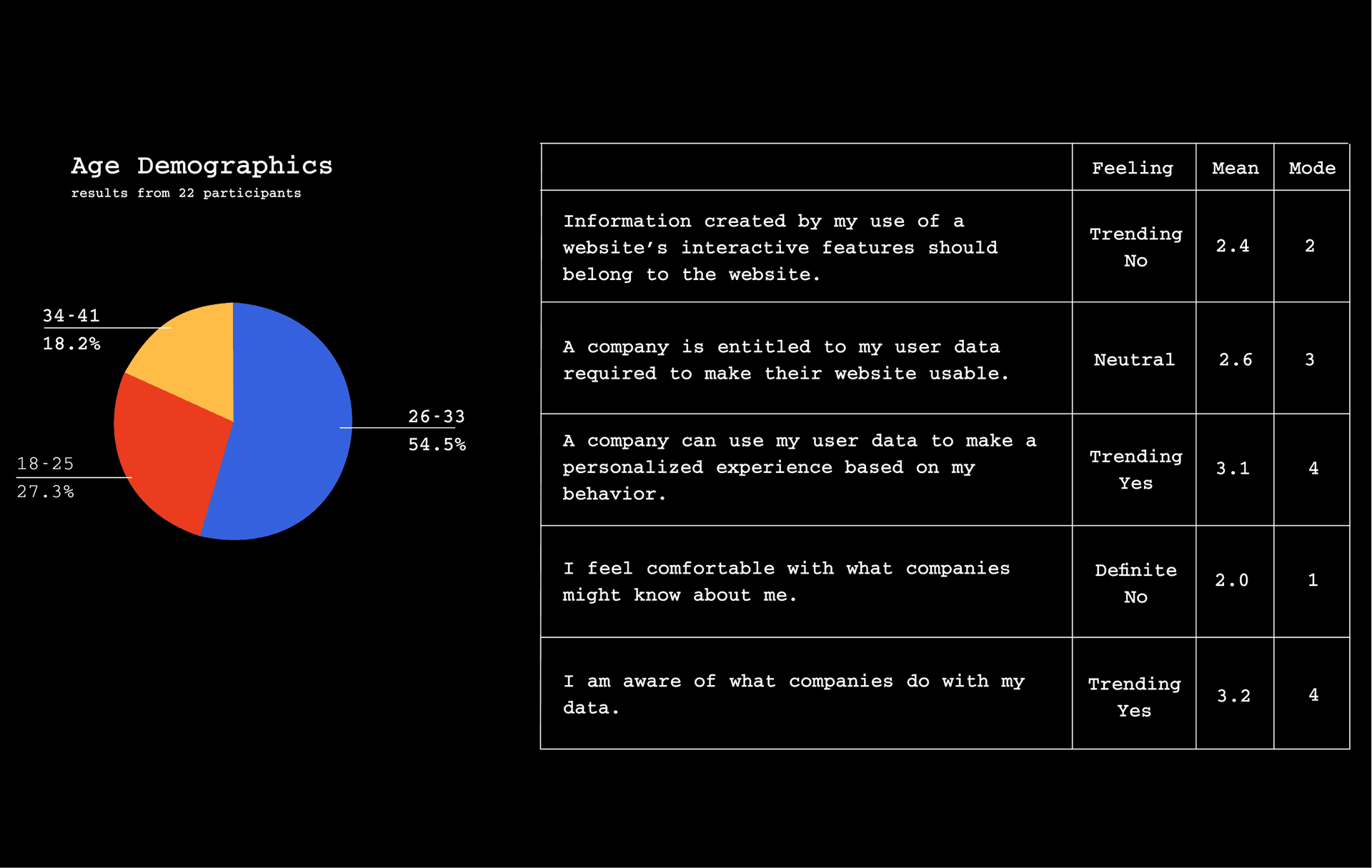
We wanted to understand how people felt about the process, so we surveyed a number of people within our academic cohort. Our user survey responses are primarily composed of 22 people in the 28-35-year-old range.
User Data Analysis
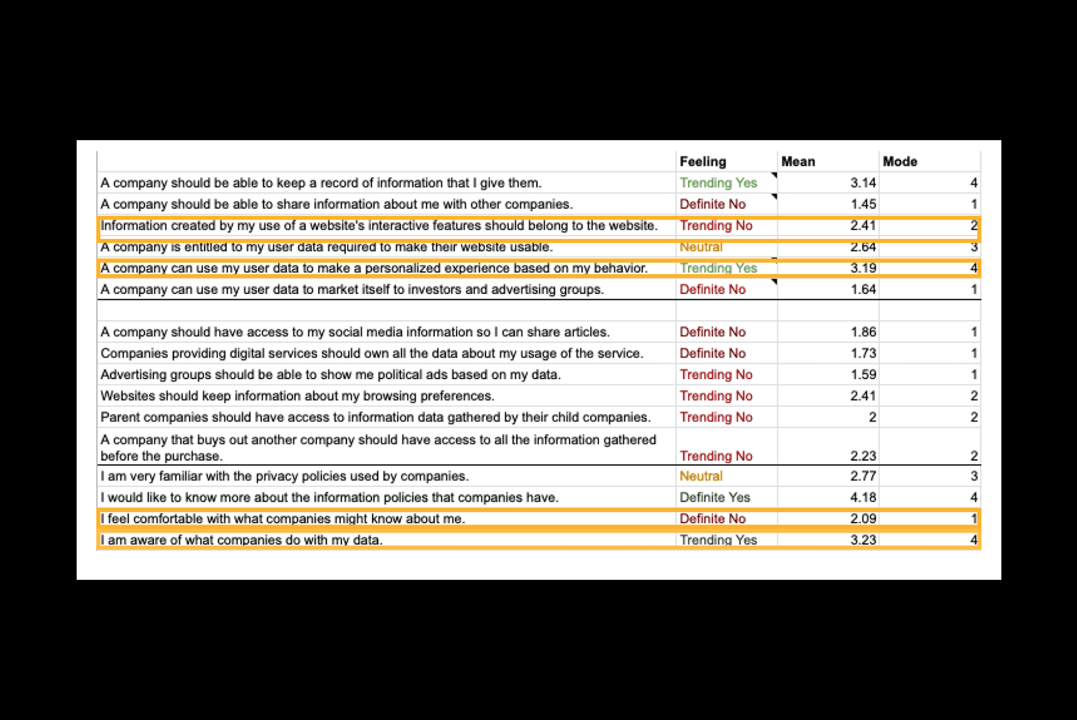
We tracked mean and mode responses on a scale of 1 to 5, where 1 is a strong disagreement and 5 is a strong agreement. And we took mode to determine how a choice might have been trending. There are places where people believe that data use is good and beneficial to them and places where they definitely reject it. It’s not a totally consistent response. The current model of accepting and declining wholesale is not able to get at this level of complexity. And what’s more, we found a gap between what people wanted control over and what was being provided by companies. There needed to be a dialogue between user and service to clarify what happens to the data.
Key Insights
Data consent and use are confusing.
It is often obscured by buttons/hidden behind pages of the contract.
The use of your data involves countless numbers of actors beyond the website you’re visiting/ service you’re using.
The language is cumbersome and difficult to understand for a layperson.
Design Goals
The primary goal — information
Secondary goal — legislative change!
Define
User Personas
Based on our focused user group, we created two user personas of users who wants to get introductory information about how their data is being collected and the different actions they can take to curb it depending on their choice.
My team wanted to create a more humane conversation with our Chatbot — Deecee.
Solution
As a team, we wanted to focus on the flow of the experience. We designed a more welcoming conversation to introduce audiences to the concepts of information privacy and what it means to accept the terms. Instead of building the chatbot, we spent our time on user research, content design, and art direction.
Sitemap and User Flow
Develop
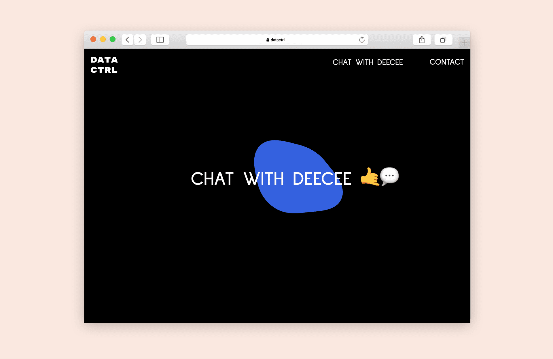
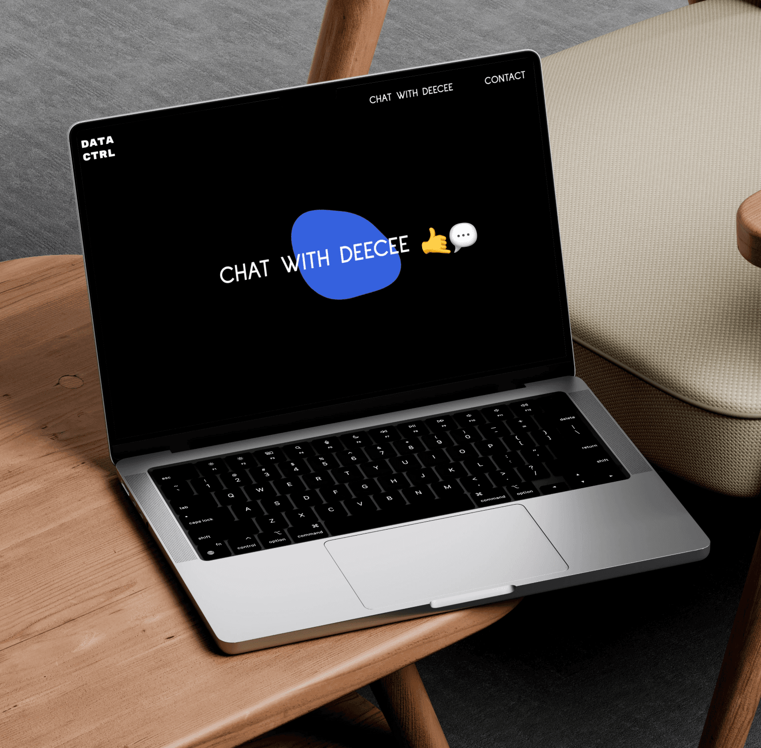
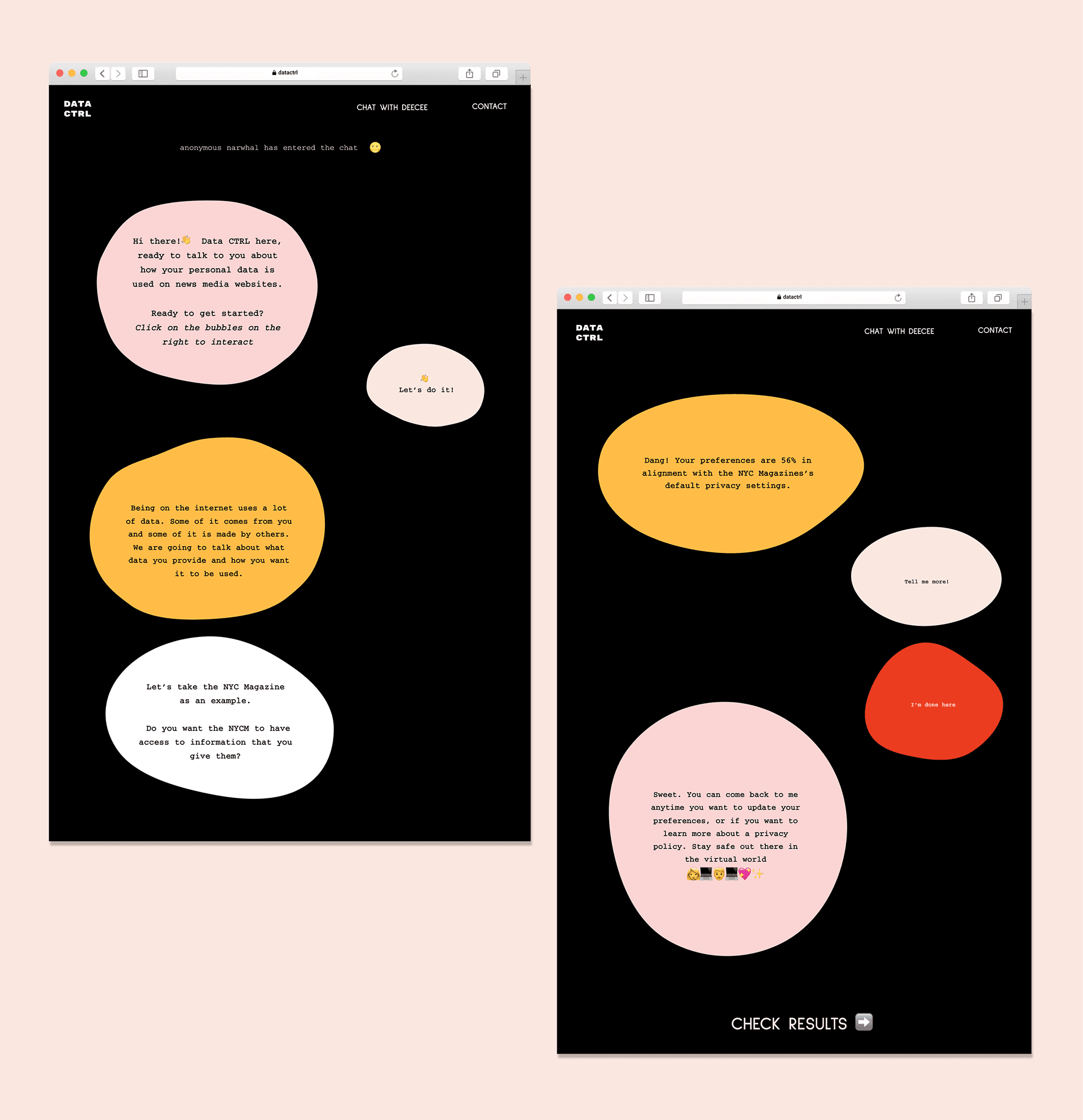
Our team designed Deecee — a chatbot where users can have a more humane conversation about the complicated components of privacy settings. As a team, we wanted to focus on the flow of the experience. We designed a more welcoming conversation to introduce audiences to the concepts of information privacy and what it means to accept the terms. Instead of building the chatbot, we spent our time on user research, content design, and art direction.
Design System
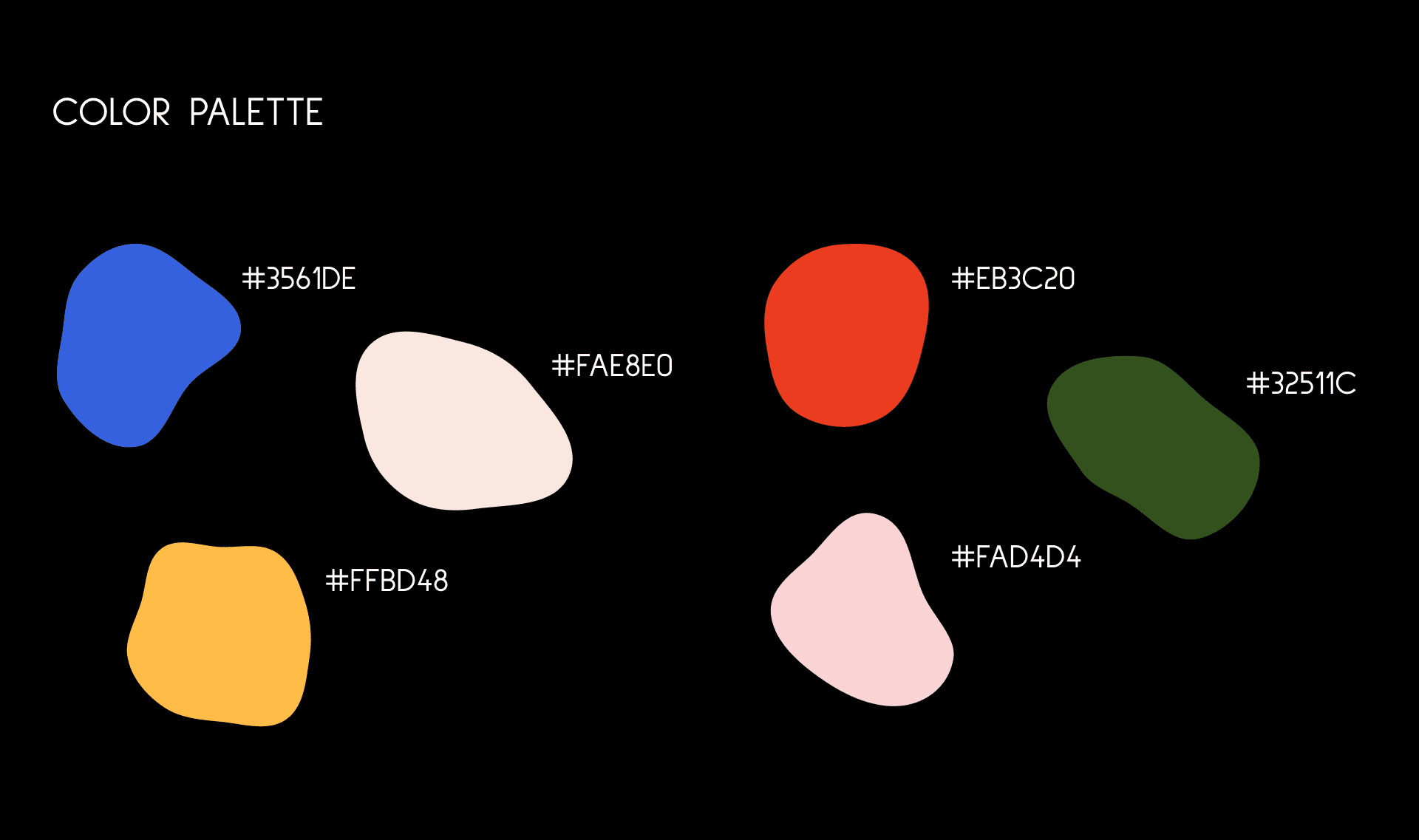
We aimed for a design that feels playful, humane, organic, and relatable to users. To achieve this, we incorporated plenty of blobs and emojis!
Users can have a more humane conversation with Deecee about the complicated components of privacy settings, and then Deecee updates the user's preferences for a particular website. It would ask the user their comfort levels with different privacy settings, and explain what changing them would mean. Deecee provides the users with a longer explanation about what a specific privacy choice might mean for them and how that might differ from the company’s own intent.
The user testing analytics indicated that the average time spent on screens was 17.6 seconds, with positive engagement on the landing screen. By adding interactive blob movements and hover effects on the buttons, we aimed to enhance the overall screen design further.
Deliver
The DATA CTRL platform was presented to the Consumer Reports Digital Labs Team as part of the 5-mins final product pitch. The feedback we received was extremely positive and we are working on the back-end and expanding this work.
Video Source: NYC Media Lab
